About
Portfolio

Flourish

Designing an IoT app to make plant care easier
A decorative header image showcasing Flourish's sensor device, a sleek and compact device designed to monitor plant health, installed in the pot of a plant. The image also features an iPhone displaying Flourish's home screen, which provides a user-friendly interface with plant care recommendations and sensor data.
Project Type
Capstone Senior Design Project
Timeline
September 2021 – May 2022
My Role
User Experience & Product Design
The Team
3 Designers, 7 Developers

What is Flourish?

Flourish is an app that provides care recommendations for your plants, paired with a sensor device that detects various conditions crucial to your plant's health. As part of the team that built this product, I focused on User Experience and Product Design, creating a high-fidelity prototype that was developed using React Native, as well as a 3D model of the sensor.

The Problem

The initial concept for this project was based on experiences that my teammates and I have had with taking care of (and failing to take care of) houseplants.

The design team started with the question: How might we bring about an innovative, positive, and effortless experience with plant care?
A cute decorative illustration of a plant.

The Process

A flow chart representing the design process, illustrating the sequential progression from market research to user research, followed by the design phase, and concluding with testing.

1. Market Research

The very first research that my team and I focused on was competitive analysis. I completed a task flow of the app Planta, which uses reminders and care recommendations to help people keep their plants alive. I wanted to understand how it structured care reminders, how it organized people’s plants, and what plant-care issues the app focused on solving.
A zoomed-out image of a task flow chart depicting the navigation process within the Planta App. The chart outlines the sequential steps and user interactions as they navigate through the app, providing insights into the user journey and key features of the Planta App.
Once I had completed the task flow and compared it to the task flows created by my team members for other competitors, I conducted a SWOT analysis to identify Planta's position within its market.
Strengths
- Automatic scheduling of tasks – you don’t have to set them up yourself
- Personalized details such as naming your plants
Weaknesses
- Can’t manually change task schedule or backlog actions
‍- Free app is very limited in functionality
Opportunities
- Further automate caretaking of plant by using AI data from plant scanner
- Connect local plant owners / general stats about nearby plants
Threats
- Scheduling is dependent on local weather information cross-indexed with a database of generalized plant care requirements and could be inaccurate in edge cases.
I then broadened the competitive analysis to also include physical products that did not include apps, such as sensors and even an automatic waterer. I started thinking on a larger scale about how various products approach making plant care easier and more convenient.
A zoomed-out competitive analysis image of 7 competitors of Flourish, outining

2. User Research

My team and I conducted research with more than 300 plant owners, aiming to empathize with their experiences and comprehend their pain points. By putting ourselves in the users' shoes, we sought to gain a deeper understanding of their needs and challenges.
We used the following methods of research:
A graphic displaying the research methods used, represented by icons for each method. The icons include a speech bubble for guerilla interviews conducted with 8 participants, a person with a speech bubble for user interviews also involving 8 participants, and a bar chart for the survey, which garnered responses from 302 participants.
To analyze our findings, we utilized word clouds and applied them to affinity mapping the transcriptions of each interview. This approach allowed us to visually identify prominent themes and patterns emerging from the interview data.
A word cloud of the transcripts of our user interviews. By far the most prominent word is Plant, followed by water.A picture of my teammate Vy and I adding sticky notes to a white board as we affinity map.

Key Takeways

People value convenience

People’s plants often die when they forget to take care of them or simply have too much on their plate. Furthermore, they find it difficult to research plant care and lack a centralized source of information.

Caring for multiple plants is a challenge

Different types of plants exhibit unique needs and challenges, and even minor variations like pot size can lead to different care requirements for two plants of the same type. Effectively managing diverse schedules for plant care poses a complex task due to these variations and individual plant characteristics.

Watering correctly is key

The most common reason for unhealthy plants among individuals with beginner and intermediate levels of plant care knowledge is typically incorrect watering practices.

People form attachments to their plants

People are often attracted to plants for various reasons, including their aesthetic appeal, the health benefits they provide, or even perceiving them as companions akin to pets. In any of these cases, the loss of a plant can be emotionally distressing.
To translate user insights to an app, I created a card sort based on features and categories that were suggested by user interview and survey participants.
A dendrogram illustrating the results of a card sort activity. The dendrogram displays three main categories with suggested names generated by Optimal Workshop. Group 1's name suggestions are 'Conditions,' 'Current Stats,' and Environmental Factors.' Group 2's name suggestions consist of 'Details of 1 Plant,' 'Education,' and 'FAQ/Facts.' Group 3's suggested names are 'Caring for Your Plant,' 'Daily Dashboard,' and 'Growth and Care.' The dendrogram visually represents the clustering and organization of the card sort results and proposed category names.

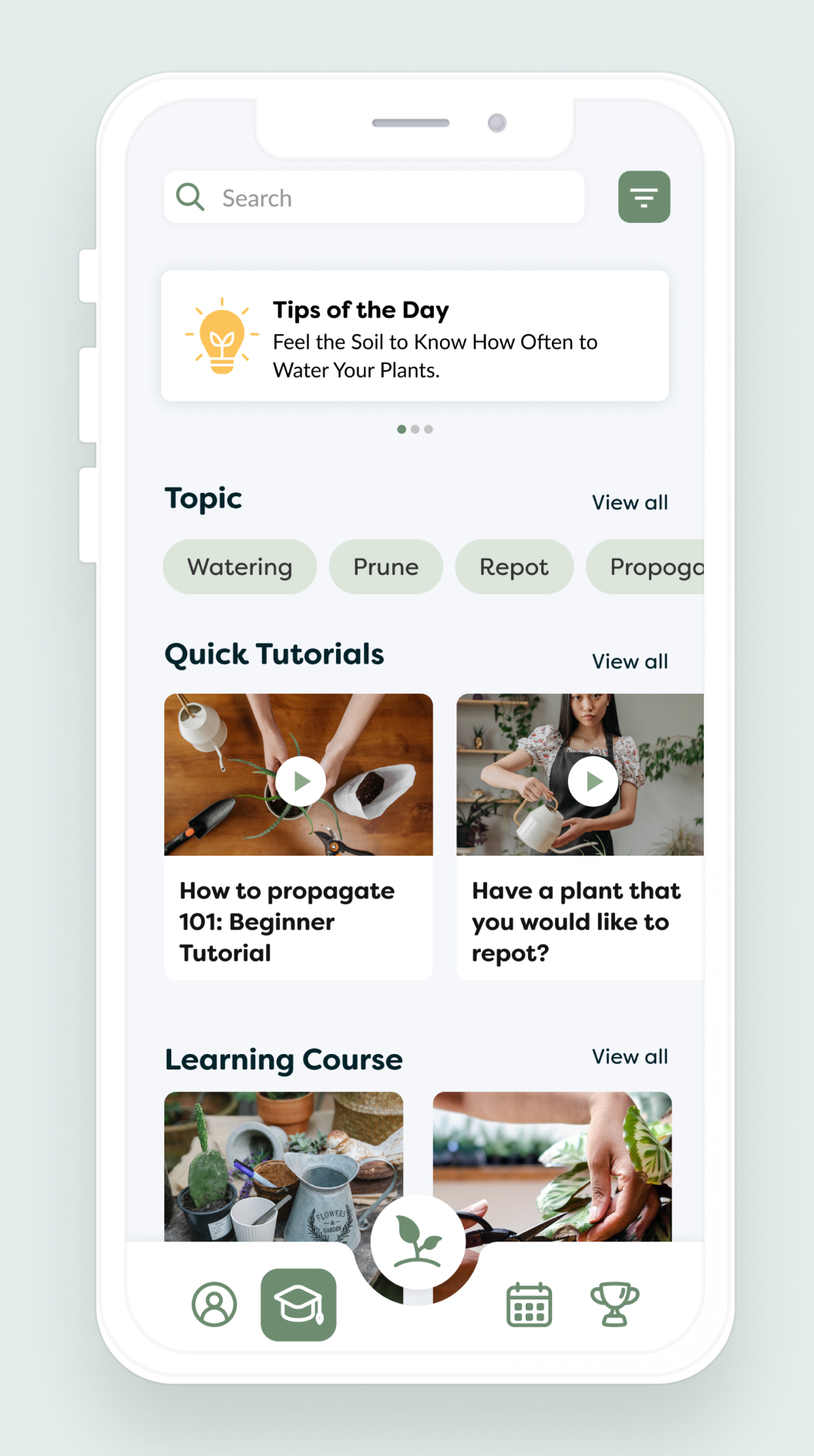
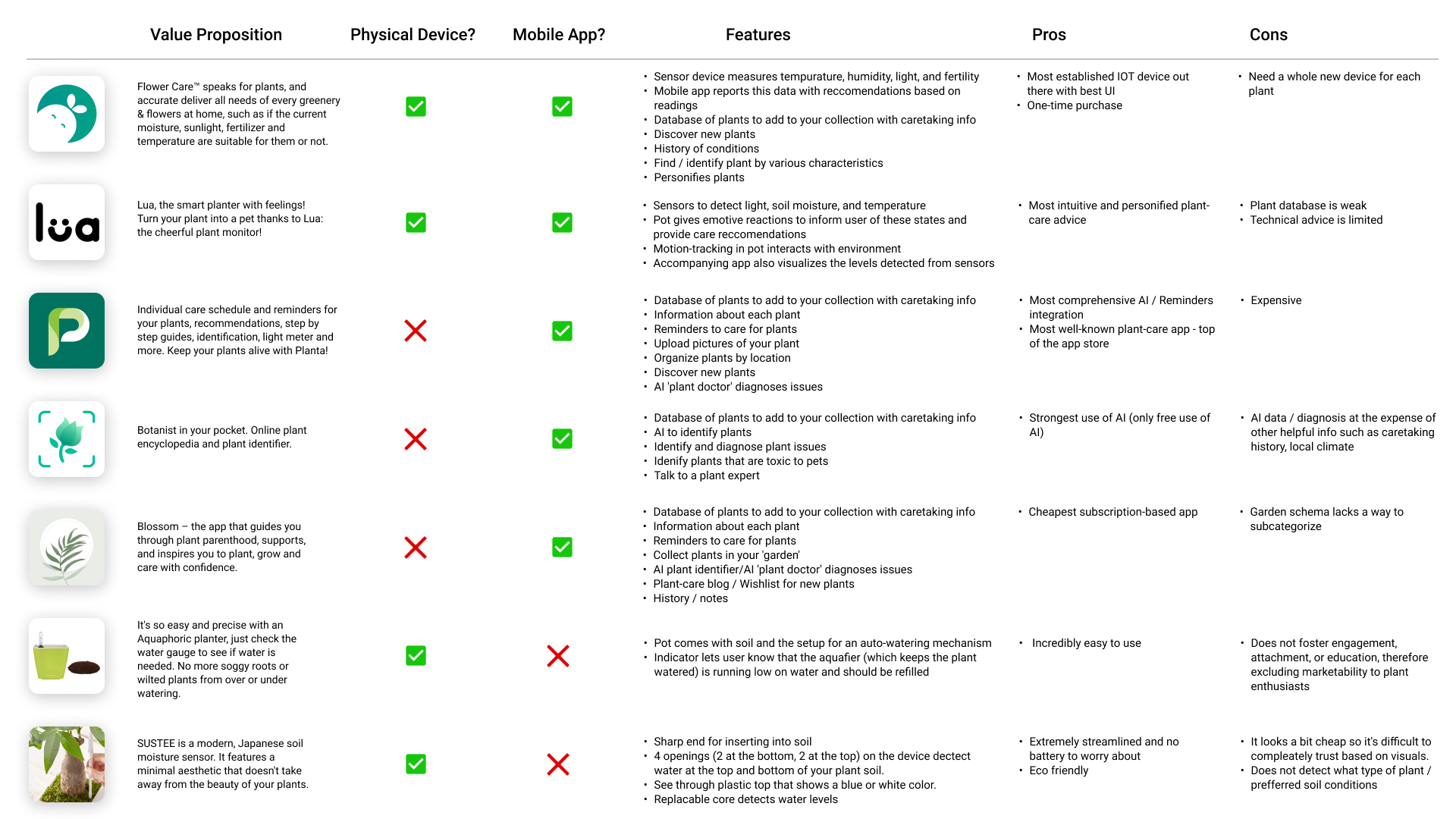
3. Design, Testing, & Iteration

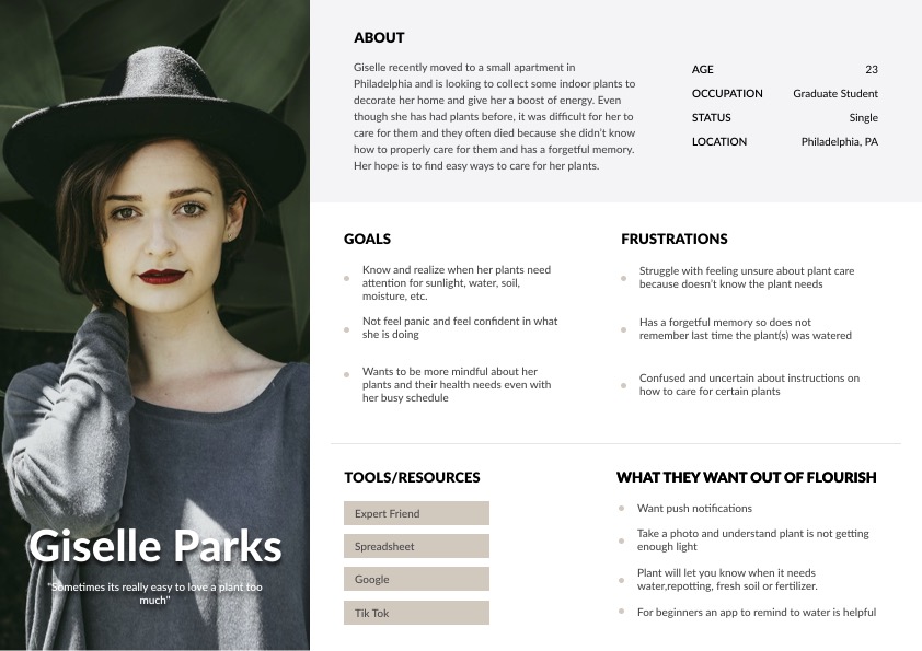
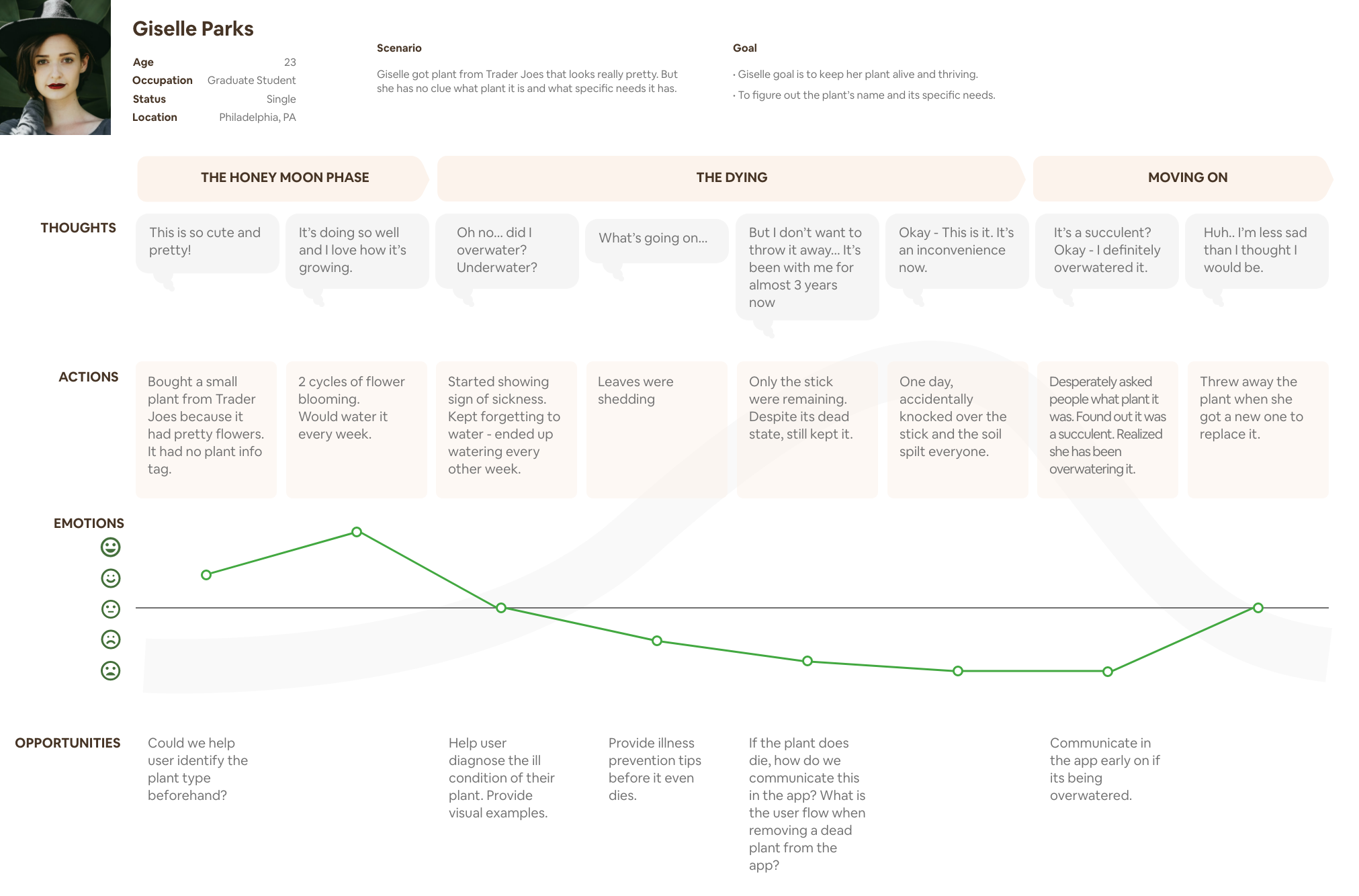
Finally, the time had come to synthesize all of our insights into design ideas! To facilitate the translation of user research into actionable concepts, my team created user personas and a journey map. These tools allowed us to better understand the needs, motivations, and pain points of our target users throughout their interaction with the product.
An aesthetically appealing user persona for Giselle Parks, our novice plant owner persona.The journey map for Giselle, our beginner plant owner user persona. She buys a succulent because it is cute, overwaters it, and it ultimately dies.
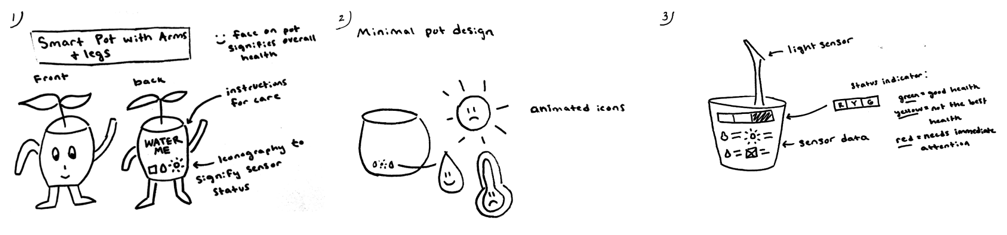
Step one of ideation consisted of sketches that helped everyone from the team communicate a few basic ideas for the direction of the app and the sensor device.
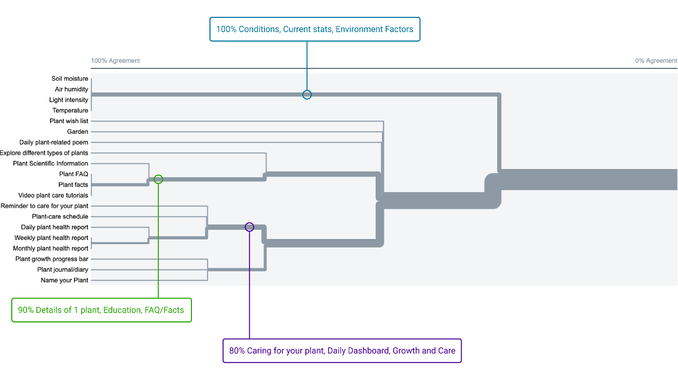
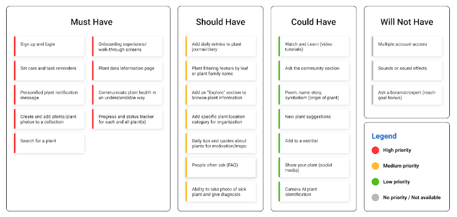
We had productive meetings with the developers and engineers to assess the technical feasibility of our ideas. Taking into account their expertise, we crafted a plan that balanced the goal of maximizing user satisfaction with the practicality and capabilities of the development team. Based on these discussions, we created a feature prioritization grid to guide us in determining the best order of implementation for different features.
At this point, we split up the pages that needed to be designed and started our first low-fidelity prototype!

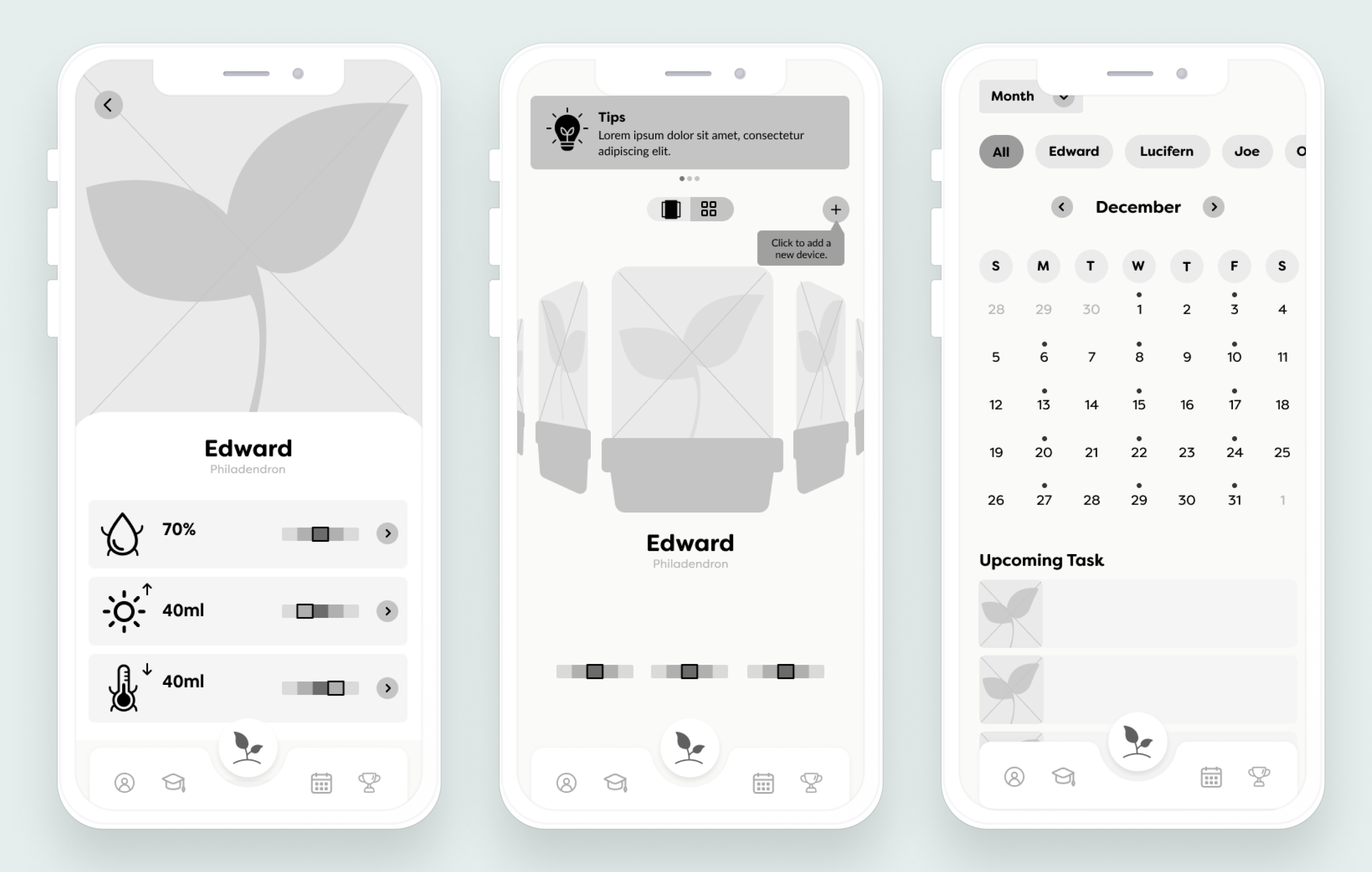
Low Fidelity Designs

To maintain simplicity in this initial phase, we decided to limit the design to shades of grey only. By using a monochromatic color scheme, we could focus primarily on layout, structure, and user flow without the distraction of color considerations.
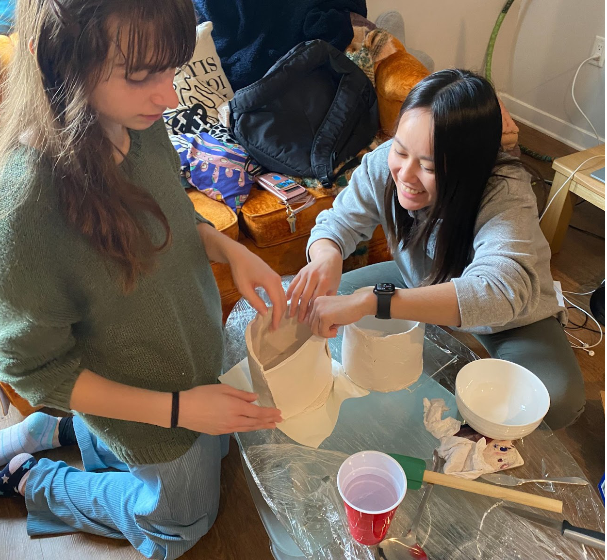
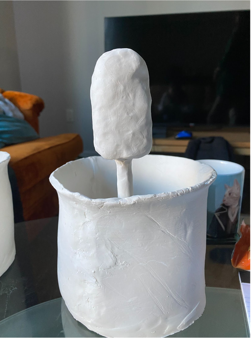
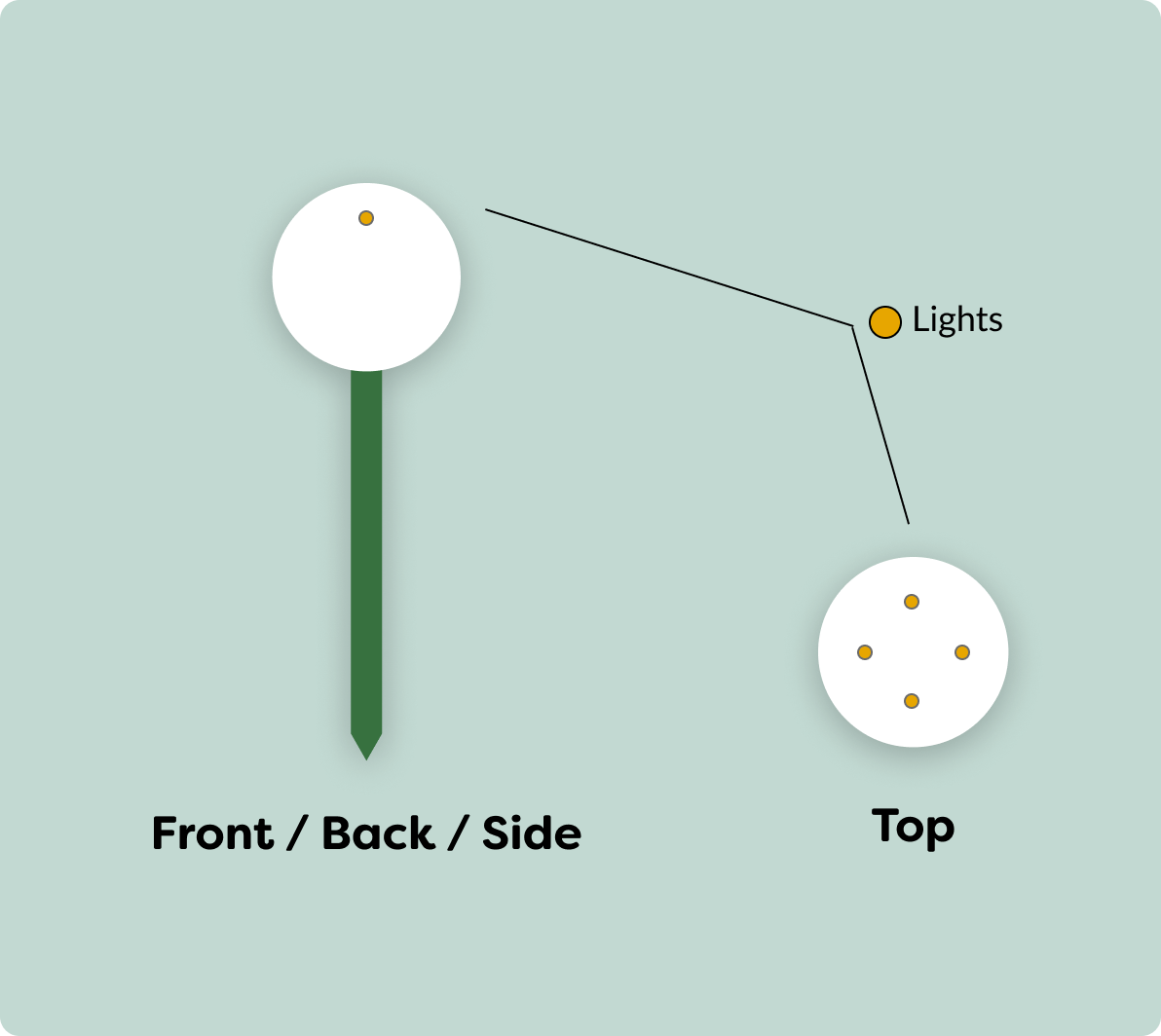
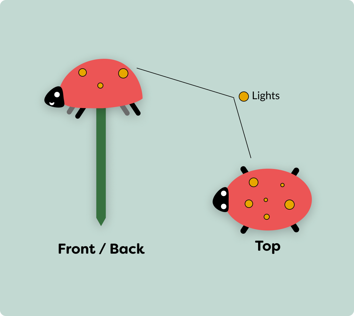
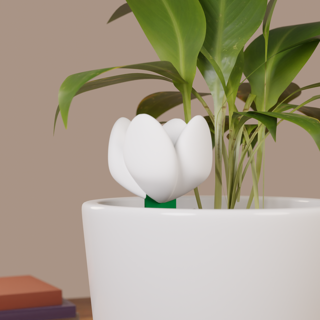
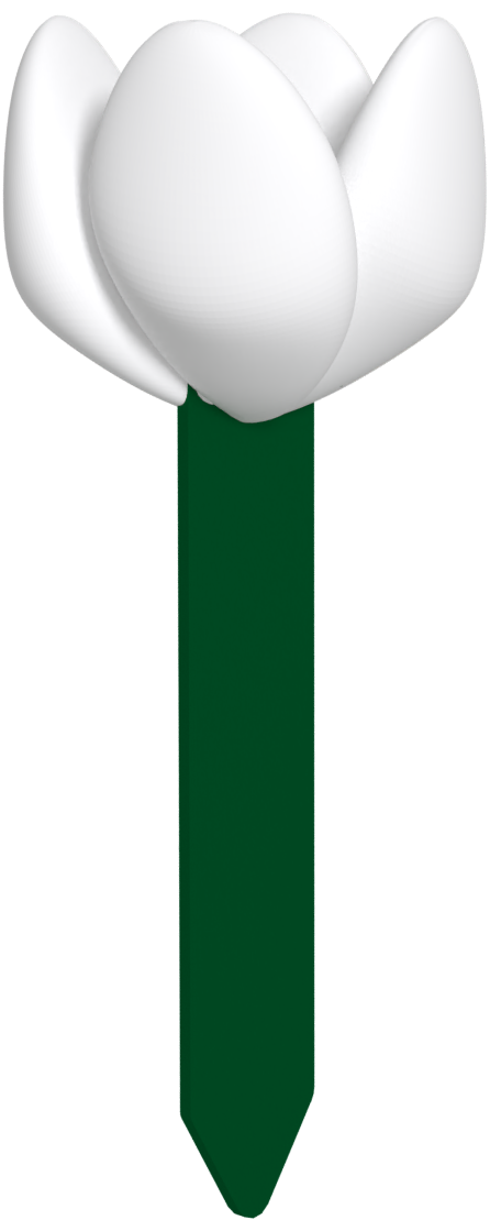
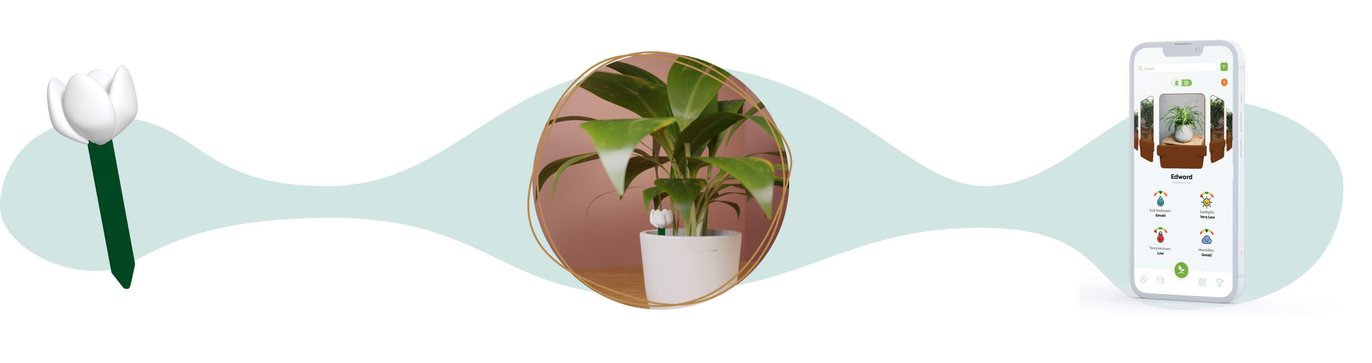
My team and I also created four clay models for the sensor. Two models integrated the sensors into a pot that could fit houseplants, while two others were for smaller devices that could be stuck in the soil of any pot.
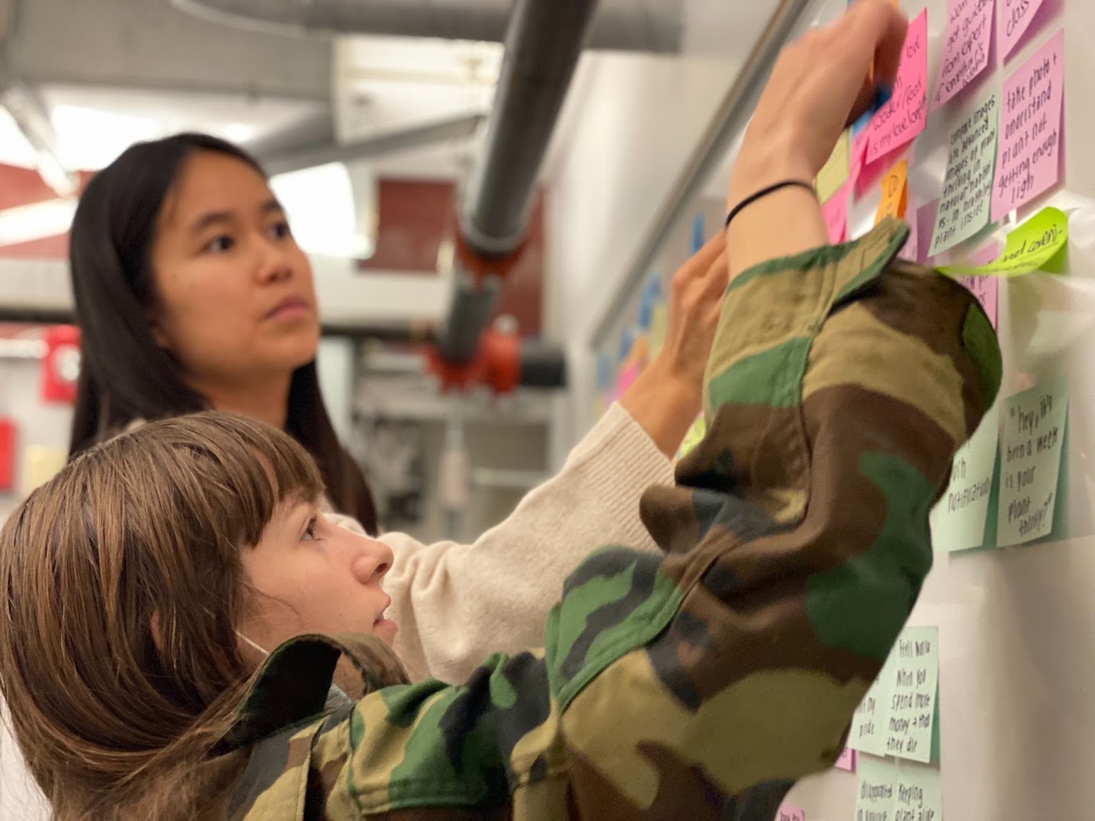
We conducted usability testing of both our app and clay prototypes with five potential users. The primary objectives of these tests were to assess the usability of the design, determine the value users found in the features, and evaluate the intuitive connection between the sensor device and the mobile app.
Before showing users the clay prototypes, my team and I led sessions by asking them to describe and draw their own ideas, before showing them our prototypes and collecting feedback. This not only gave us an idea of their mental image of a plant sensor, but also primed them to be more critical of the clay models.

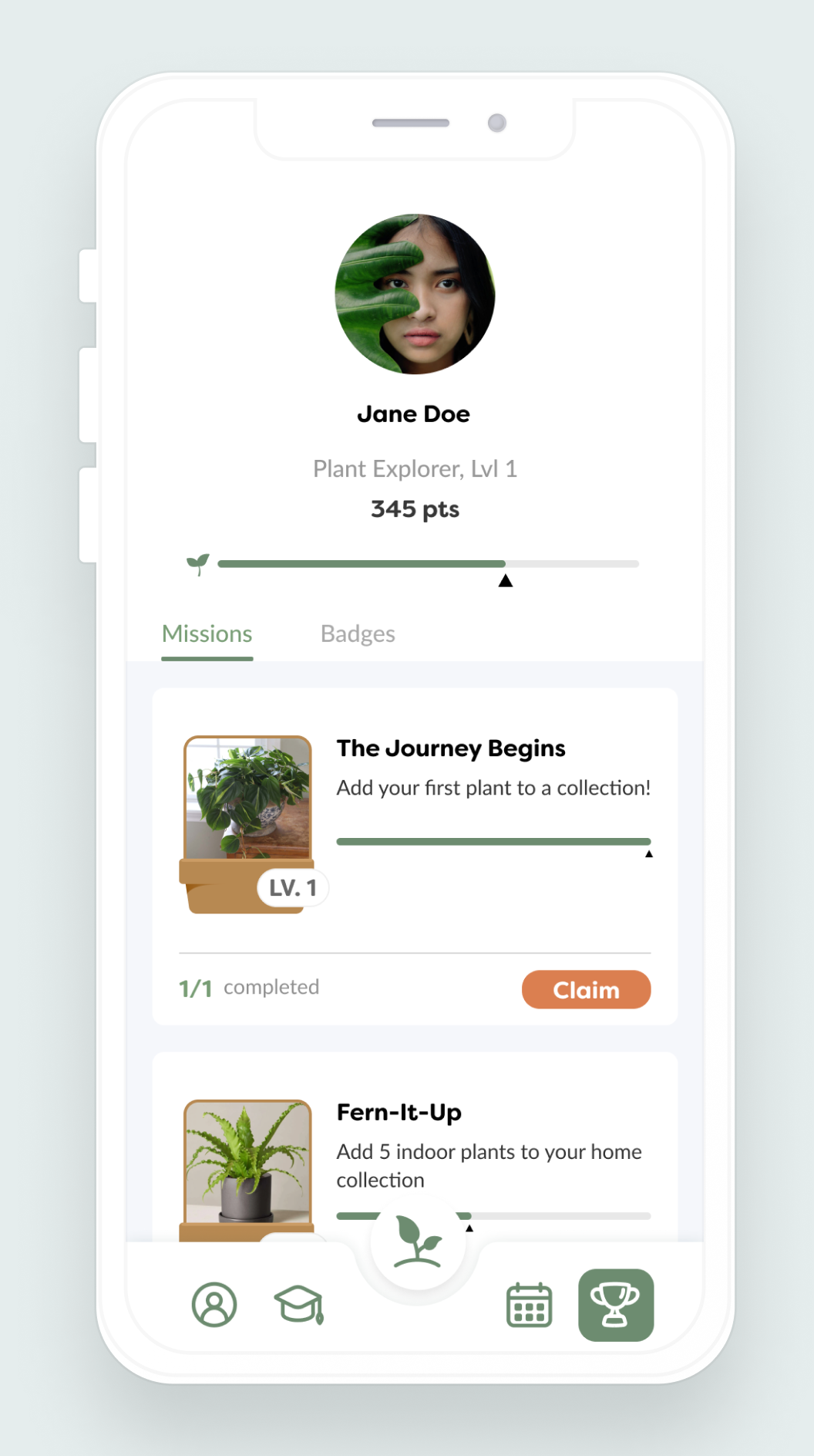
Mid Fidelity Designs

For the mid-fidelity prototype, my team and I incorporated copy, color, and images, while also implementing changes based on the feedback we received from the low-fidelity prototype.
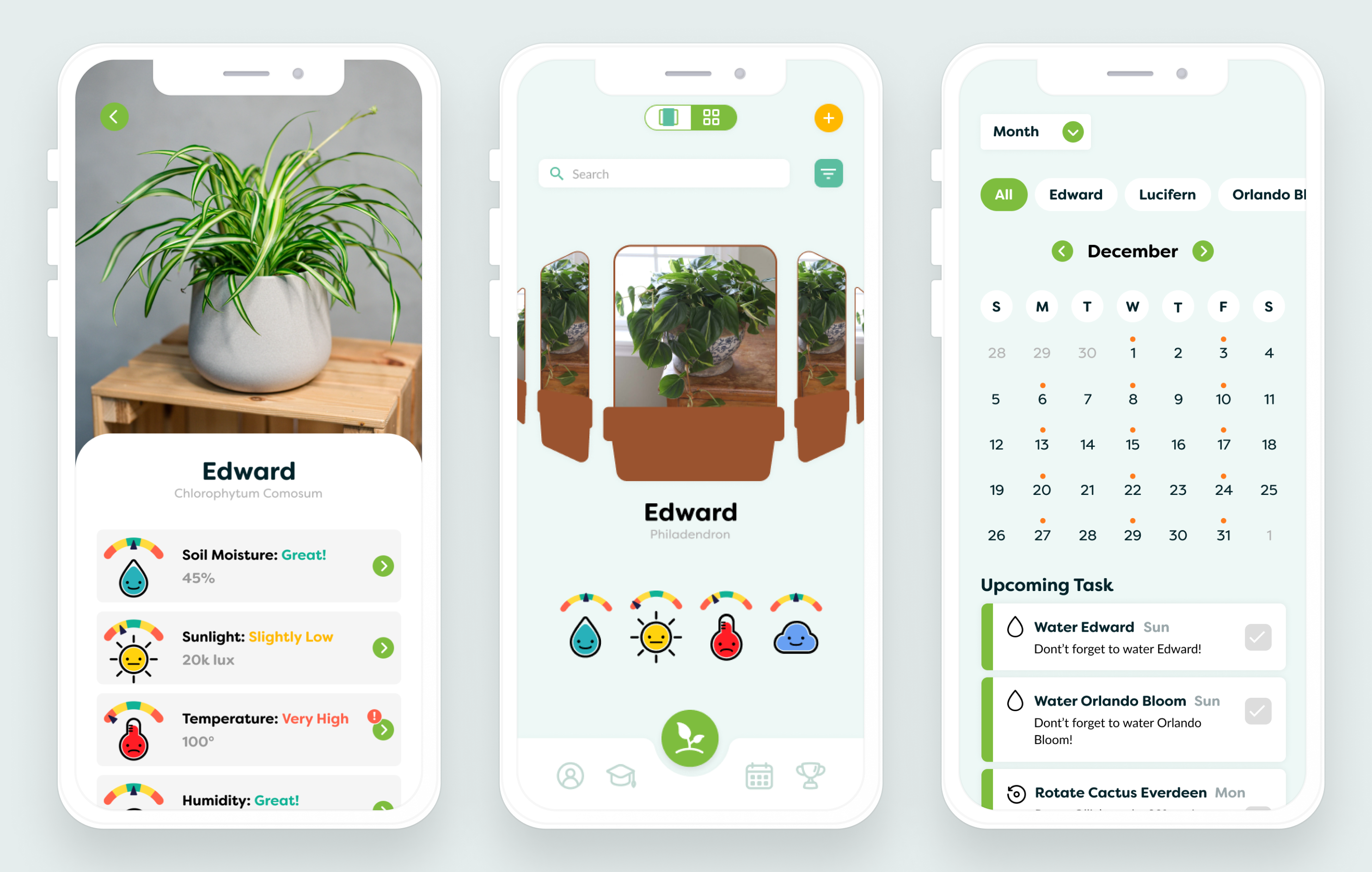
My team and I user tested the mid-fidelity prototype with 5 more people in our target demographic. We came away with over 100 changes to make to our app, both big and small. We also learned that the colors we had initially chosen didn't match the calming and feel-good mood that we wanted our app to deliver.
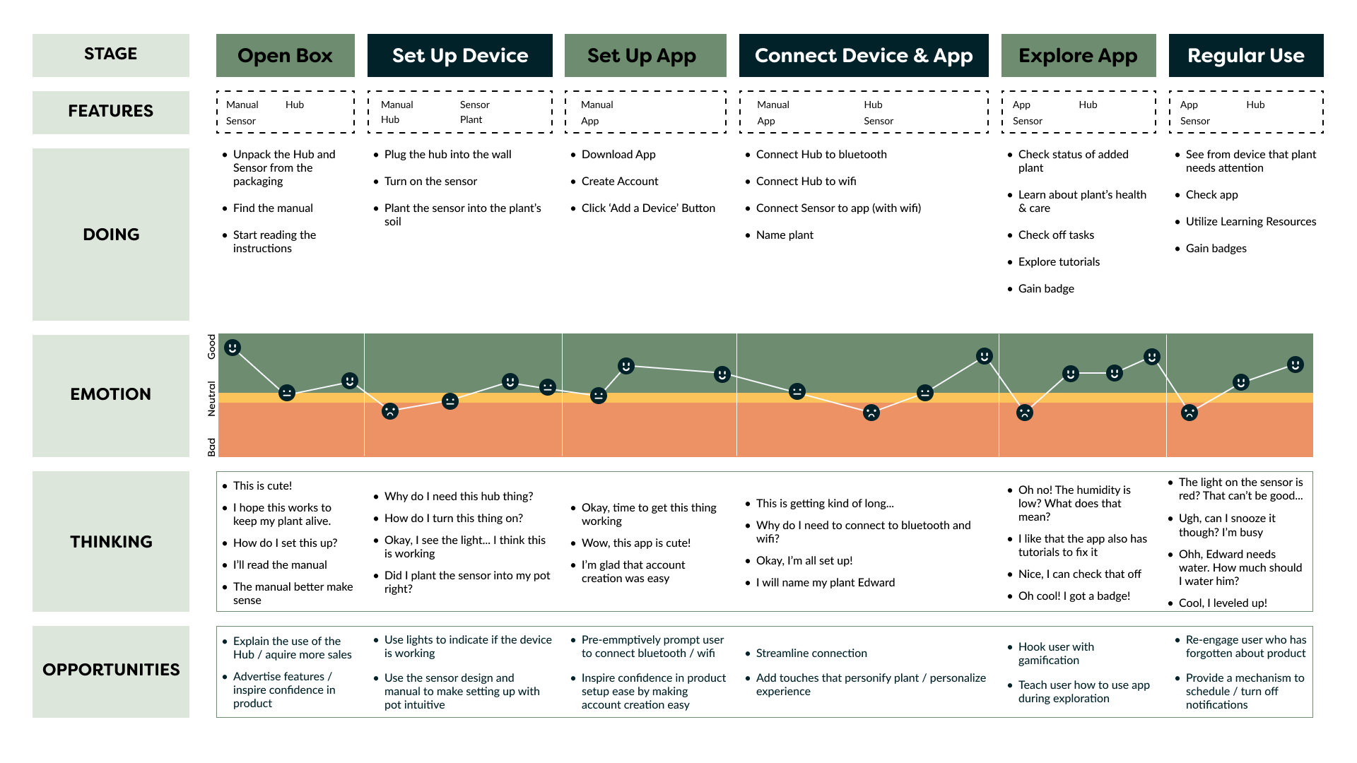
It was crucial to define and test the process by which the device and app would connect. We recognized that the setup procedure had the potential to be a significant source of confusion for users. To address this concern, I created a journey map outlining the steps and interactions involved in the setup process. This journey map was informed by the insights gained from our initial round of usability tests, allowing us to identify pain points and areas of improvement to streamline the device and app connection experience.
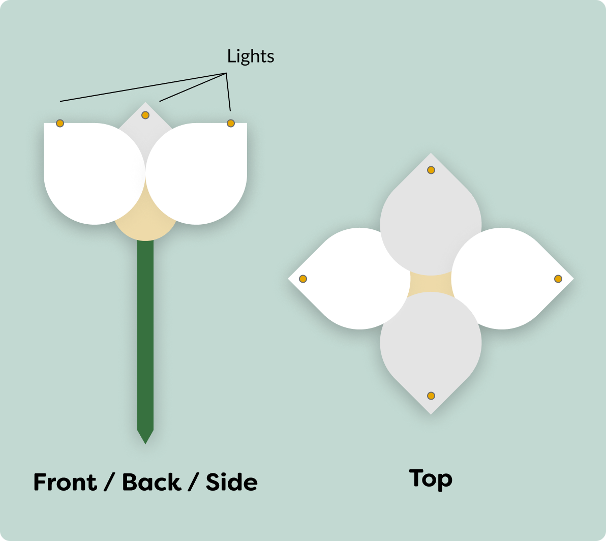
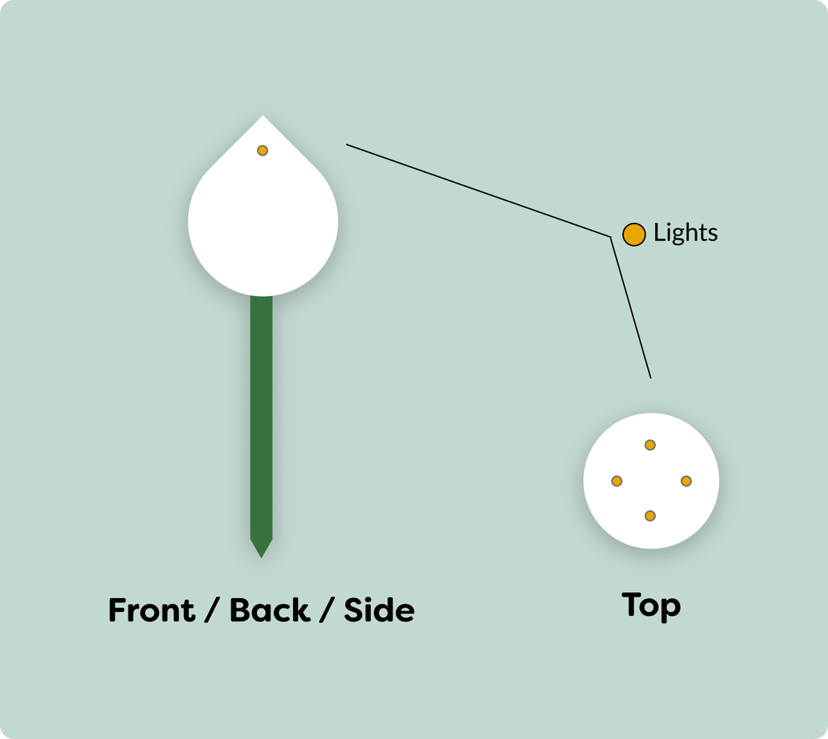
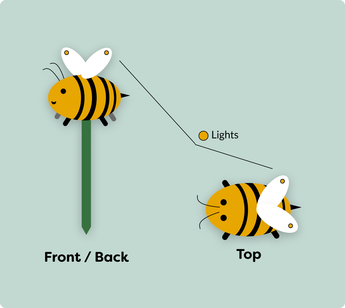
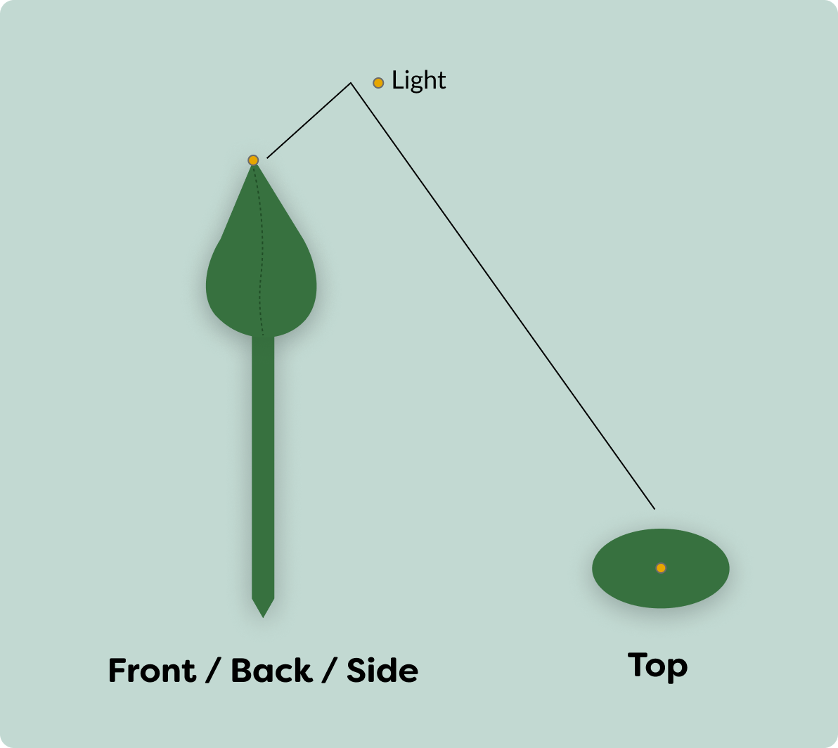
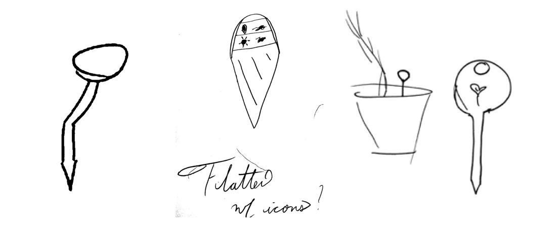
I also wanted to experiment with sources of inspiration for the look of the sensor device. I was quarantining with a COVID exposure at this point, so I couldn't do in person testing. I pivoted by creating a survey with simple 2d drawings of some ideas to collect user feedback.
Based on survey feedback, I learned that users would prefer a simplistic design that would blend in with the plant. One user summed this sentiment up well, saying:
"Shouldn’t stand out by default - either designed so the eye
skips over it or doesn’t stand out as a sensor in particular
"

The Solution

In ten months, my team and I successfully transformed a loose concept into a user-validated high-fidelity app design. Our design has been built in React Native and is available on TestFlight.

Garden Screen

Looking to keep your plants happy and healthy? Monitor all of their health through sensor data.

Plant Information

See more detailed information about each individual plant, including its origin and specialized care.

Track Over Time

Check in on how your plant has been doing for the last week - consistent care is key.

Track your Tasks

Need care reminders? Keep up with all of your plants needs in one convenient location

Learn and Grow

Don’t know where to start? Flourish provides learning tutorials to support and expand your plant knowledge.

Earn Rewards

As you progress in tutorials and continue to care for your plants, you can earn badges and level up.

I also 3d modeled a final sensor device design using Blender.
Our final design was navigable by 100% of users it was tested with, and the majority of users reported that they would use the product if it were to go into production.

Flourish also won multiple awards. The team of developers that worked on this project were recognized by Drexel University's 2022 senior project showcasing, winning first place in the entrepreneurial category for their development of the app and sensor. More information about this distinction can be found here.

The design team that I was on was a 2022 Silver Winner for the Muse Creative Awards, an international competition for creative professionals. More information about this award can be found here.